
A reliable
partner.
When the German logistics company RDL approached me for a rebranding, their goal was clear: to embody their values, differentiate themselves from competitors, and attract both clients and prospective employees.
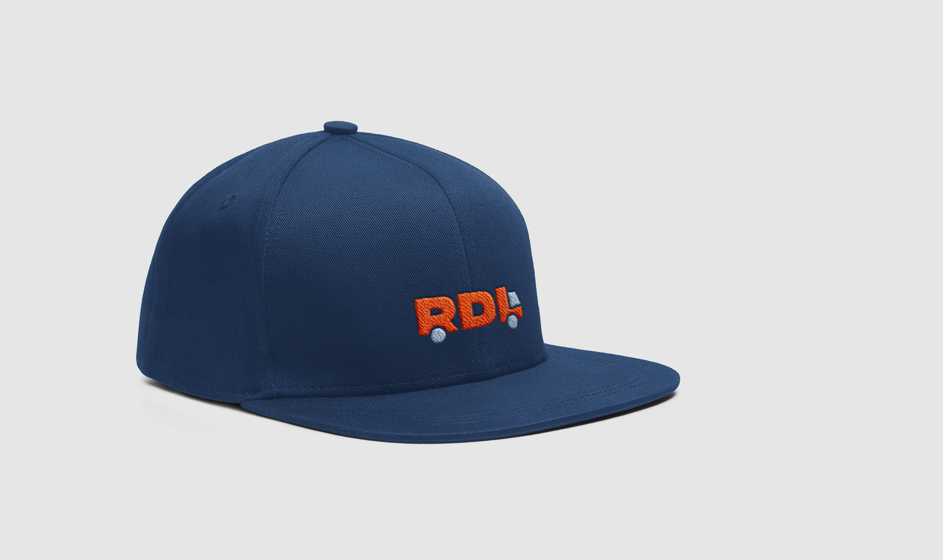
The distinctive logo, the bold color palette and strong typography now showcase the true strength of this family business – being an efficient, friendly, and dependable partner in the industry.
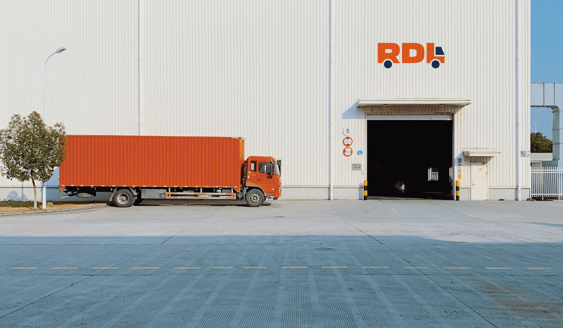
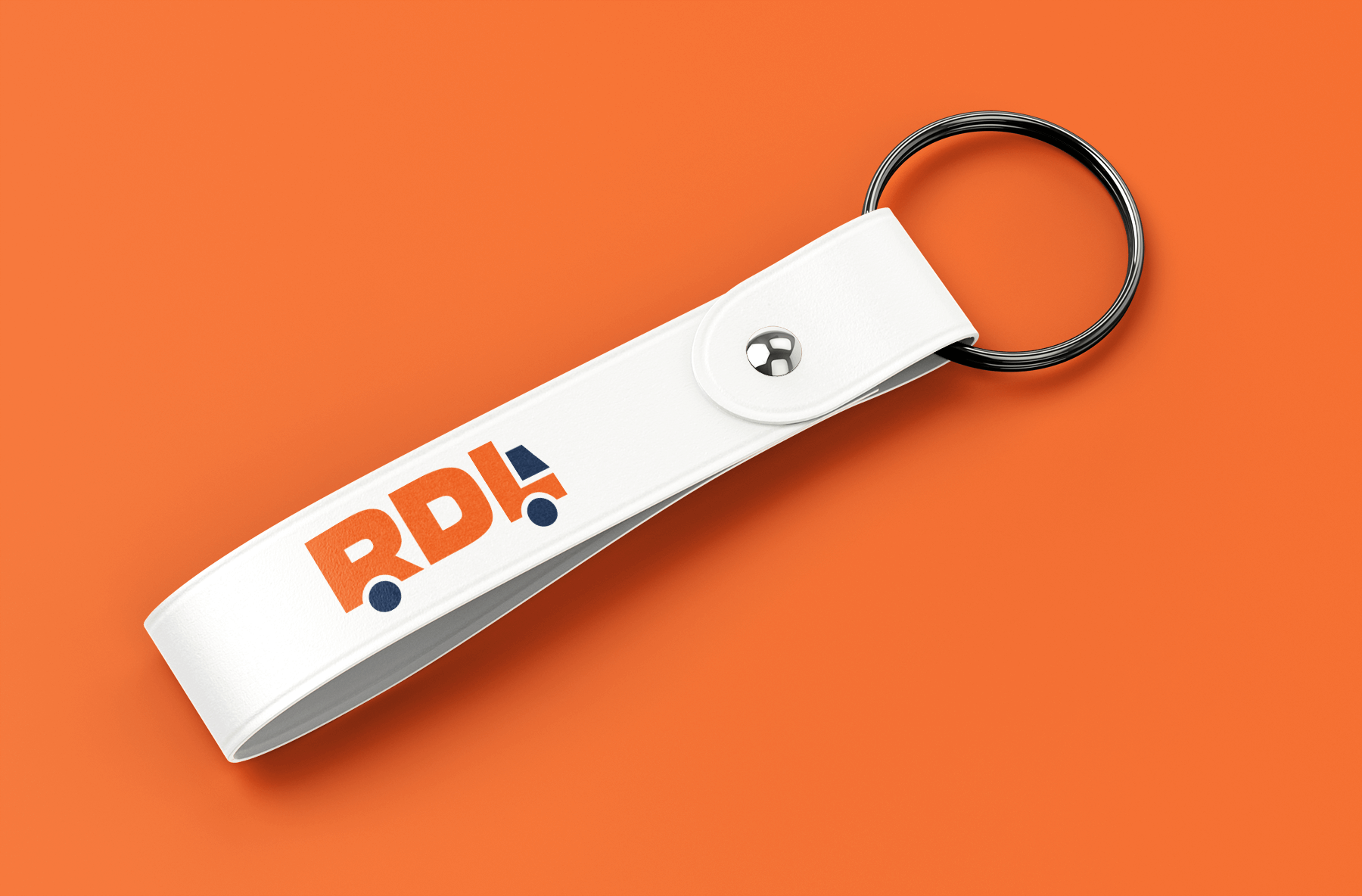
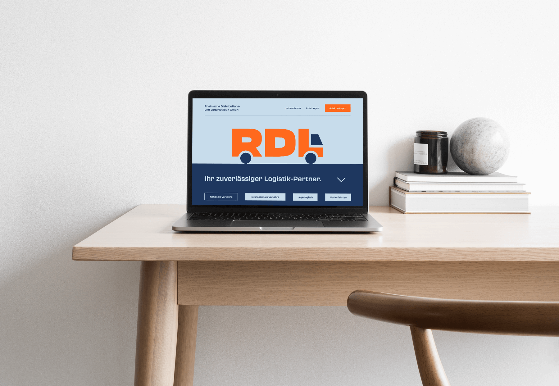
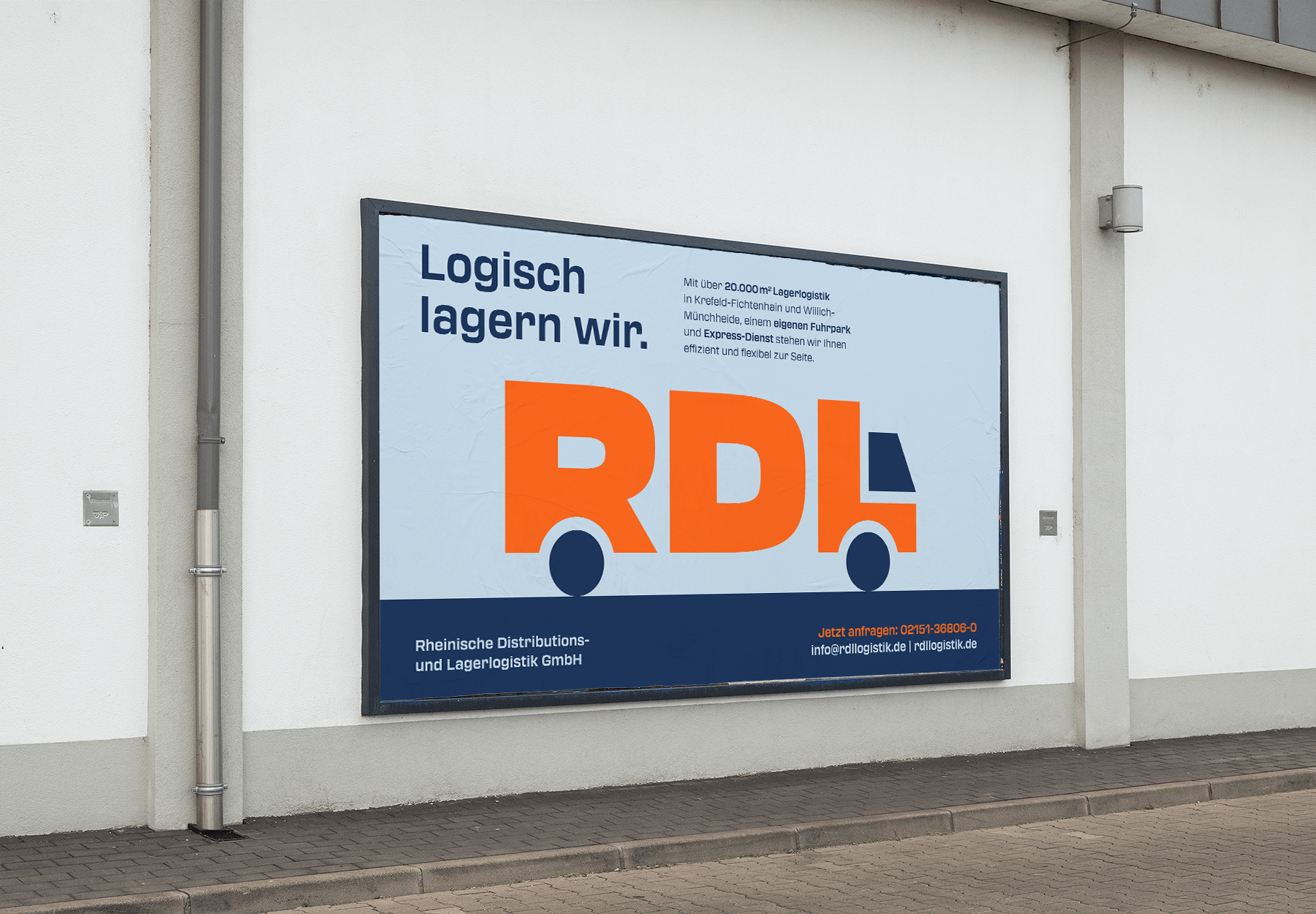
The RDL logo serves as the core element of the new branding, representing the company's mobility and expertise. The truck embodies these qualities while adding a strong sense of recognition.
The design features bold forms and vibrant colors, striking a harmonious balance between strength and approachability.
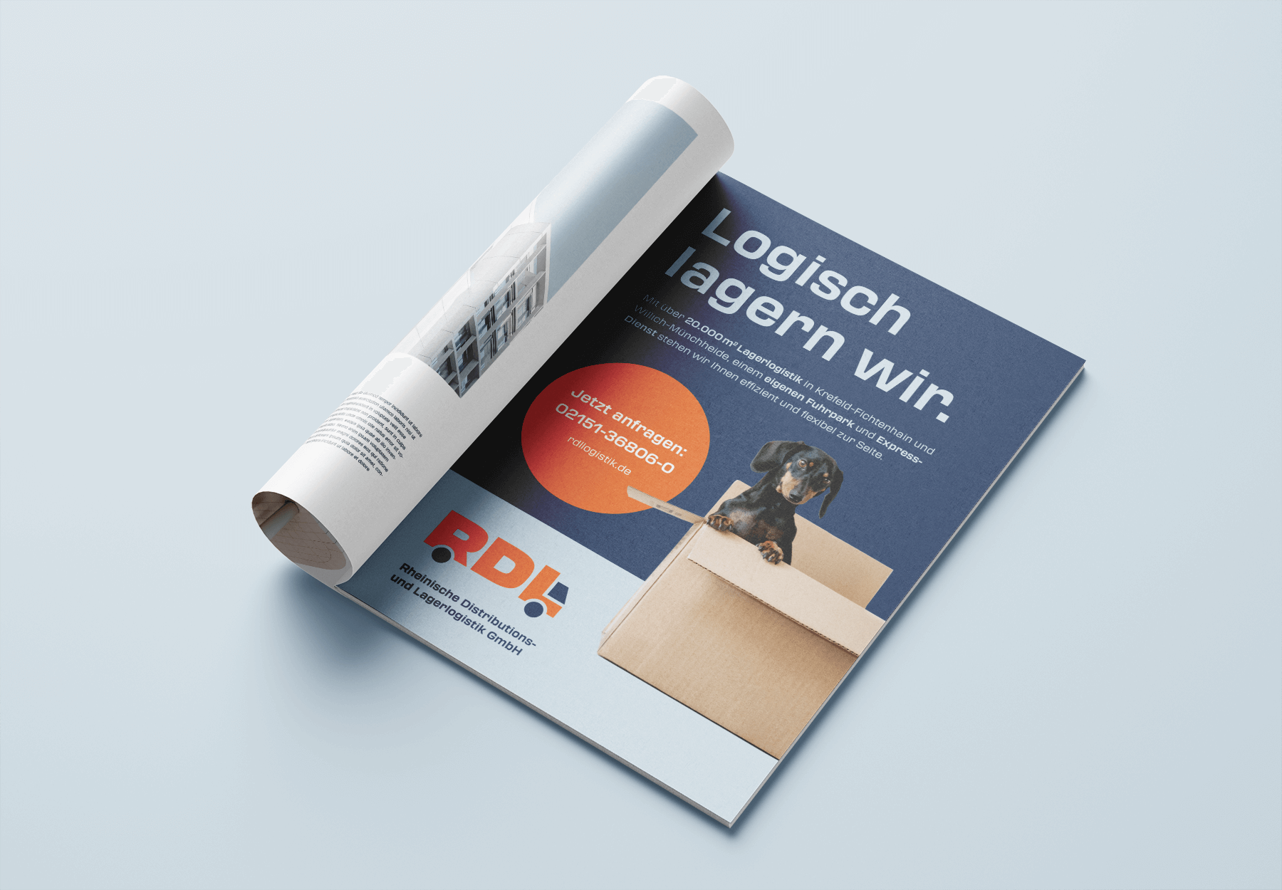
The logo can also be utilized as an eye-catching key visual, as showcased on the new website (note: design only, not development).
Client Feedback:
Working with Tara on our logo design was a breeze. We instantly felt a strong connection with our brand and were thrilled to start printing materials and merchandise for our employees right away. She understood our vision and delivered a logo that represents who we are.